


Health Karma Case Study
A dashboard where families can manage all their healthcare needs in one place.

Project Overview
Tools: Sketch, Pen and Paper, Figma
Project Type: Design Sprint
Timeline: 1 week
Client: HealthKarma

Assumptions:
Legal guardians are too busy to keep track of appointments.
Legal guardians will forget and neglect healthcare needs because of dependents.
Guardians would appreciate something like this.
How Might We Question:
How might we allow users to manage multiple aspects of healthcare in a single space for both them and their families.

Interviews Criteria
30+ years old
Responsible for multiple family members
Multitasker
Ideally part of the LGBTQ Community

Interview Findings
5 out of 5 interviewees would like to have a more convenient way to manage their healthcare.
5 out of 5 people interviews who identify as LGBTQ often feel uncomfortable or left out when it comes to questions and forms from their doctor and insurance providers.
3 out of 5 people have their entire family on one plan.
3 out of 5 interviewees call their doctors to schedule their appointments.


Sketches
We sketched out various options on what would be best for the user to see all their information as simply and quickly as possible. Then voted on specific ideas we liked, and expanded on the ones with the most votes to further discuss where to go from there.

Why Barbara and Joan?
With the landscape of family dynamics constantly changing, we felt it was important to focus on the modern family. The nuclear family, as we know it, has evolved. Modern families encounter an entirely different set of pains and frustrations. By shifting Health Karma’s focus to a more dynamic modern family, we’ve created the space for them to expand and build a platform where all types of families can feel safe.

Wireframes
After compiling our secondary research, interviews, and competitor research we were able to create wireframes that would best suit Barbara, our busy persona.
We met with our client to see what changes needed to be met to best suit the customer needs, and to be closer to the client’s desired solution.
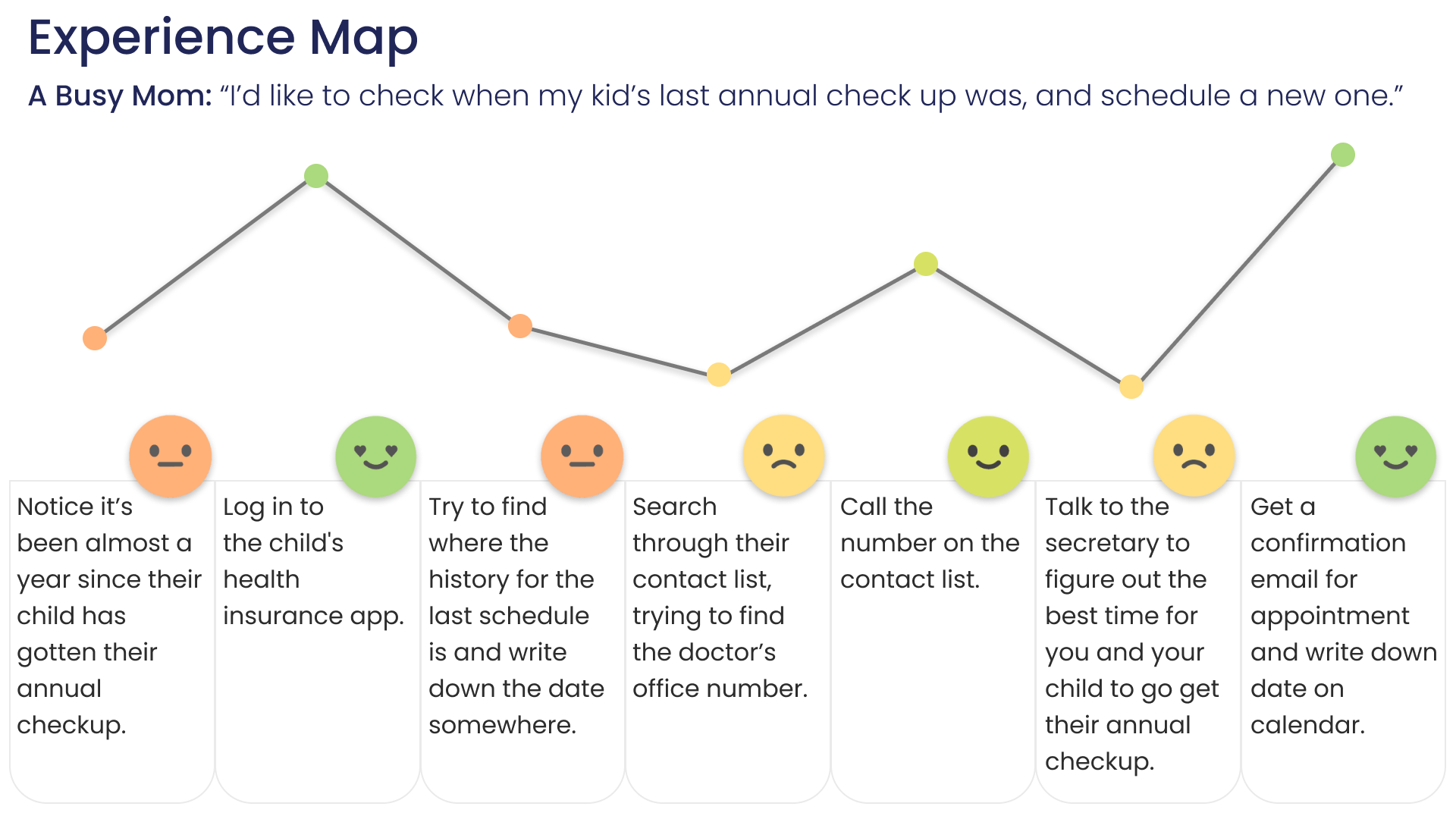
Task Flow to follow: As Barbara, we’re clicking into Jaime’s page which has a notification to schedule his next vaccine appointment. So when prompted, the user will schedule the next appointment for Tuesday, March 23rd at 10:00am.
User Testing Findings and Iterations
Customizable widgets - Users responded well to the personalization aspect of the design, and wanted to see more of that.
File Folder Design - Users liked the familiarity with the folder design. Users had a good reaction.
Outstanding Balance - Most users pointed out this is of the most importance to them.
Next Steps
More User Testing - Test The hi-fi version of this prototype with users for changes, updates, and reassurance.
New Task Flows - Incorporate more task flows. From dashboard into schedules, prescriptions, doctors, wallet and more.
Personalized Widgets - Users can personalize their widgets according to level of importance to them. Users appreciate widgets more for the personalization and productivity it provides.